Tufte’s Visualization Aesthetic
==2024-12-24=!=
<% tp.file.cursor(4) %>
Theory
Tufte’s Visualization Aesthetic
Edward Tufte, a pioneer in data visualization, outlined principles for designing effective and truthful visualizations. These principles focus on reducing visual clutter and maximizing the clarity of data representation. Key aspects include:
- Maximize Data-Ink Ratio
- Data-ink refers to the ink used to represent data in a chart.
- Minimize non-essential ink (e.g., decorative elements) to focus on the data itself.
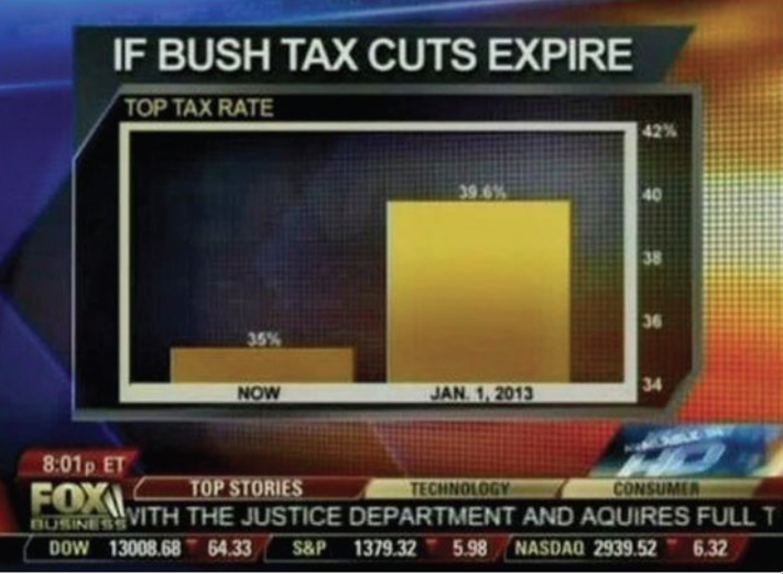
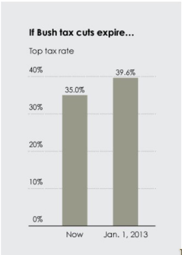
- Minimize Lie Factor
- Ensure the representation of data is proportional to the values depicted.
- Avoid visual distortions that exaggerate or diminish differences.
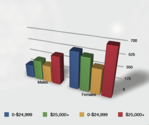
- Lie Factor: Dimentionality
- The fixing a two or three-dimensional representation by a single parameter yields a lie, because area or volume increase non-proportionally to length.
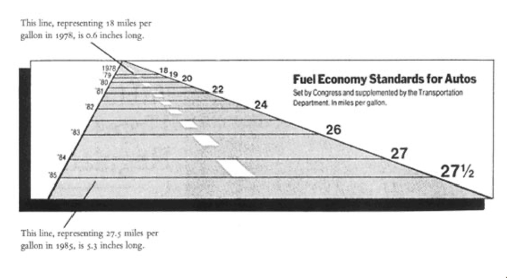
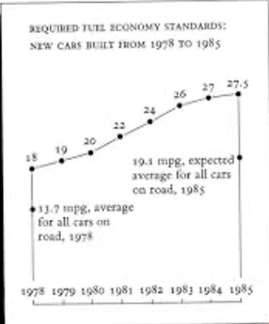
Graphical Integrity: Scale Distortion
- Always start bar graphs at zero.
- Always properly label your axes.
- Use continuous scales: linear or labelled!
- Aspect Ratio: The steepness of apparent cliffs is a function of aspect ratio.
- Aim for 45° lines or Golden ratio as most interpret-able.
-
Minimize Chartjunk
Strive for simplicity and elegance in design. Remove unnecessary design elements like:- Extra Dimensions
- Heavy grid-lines
- Excessive use of colors and patterns
-
Use Proper Scales and Clear Labeling
- Employ scales that are appropriate for the data and context.
- Clearly label:
- axes
- Data Points
- Key Trends
Tufte’s principles serve as foundational guidelines for creating Data Visualization that are both aesthetically pleasing and effective in communicating data-driven insights.
Examples
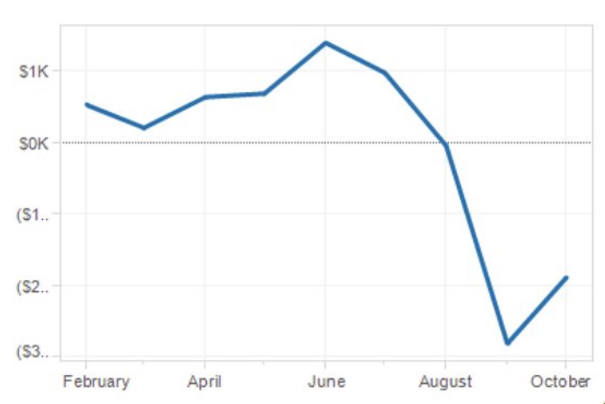
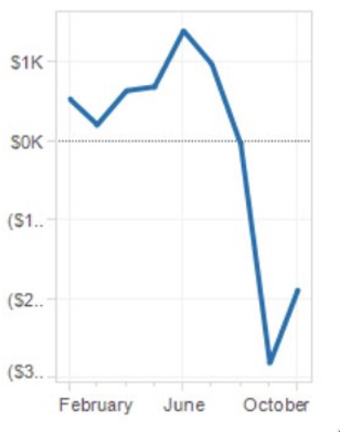
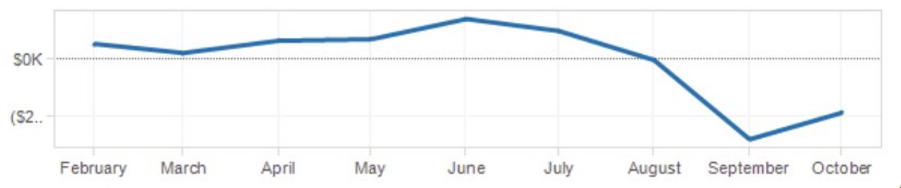
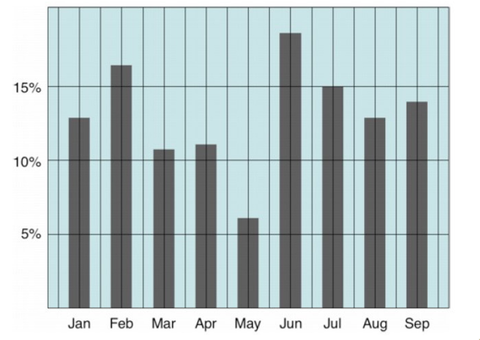
Simplifying a plot:
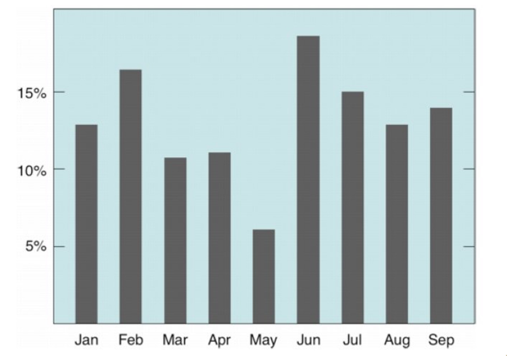 Removed Heavy Gridlines
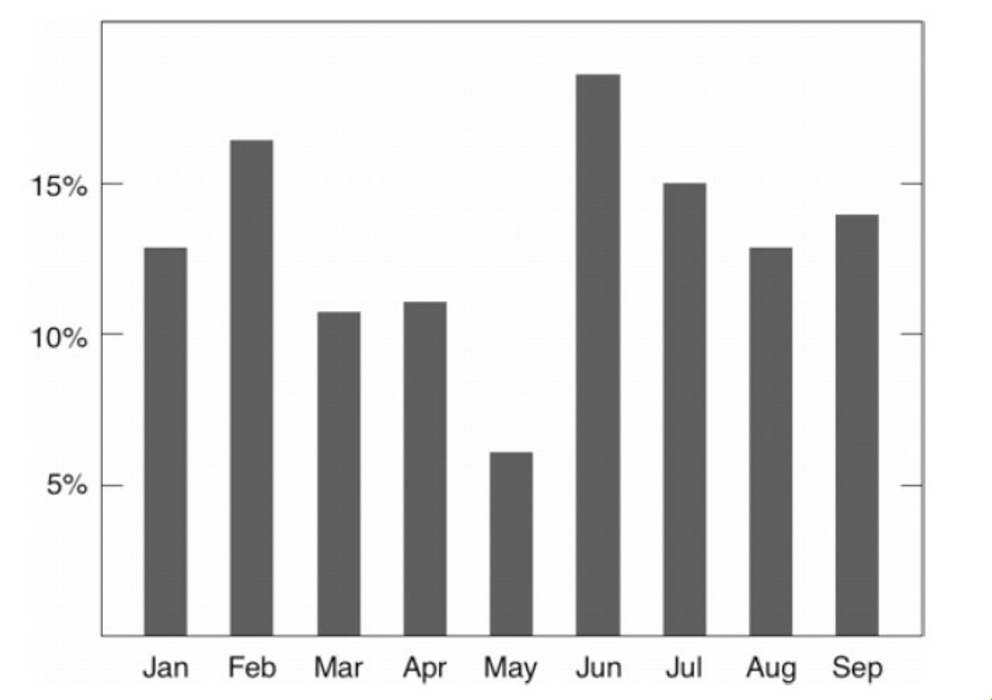 Maximizing Data-Ink Ratio
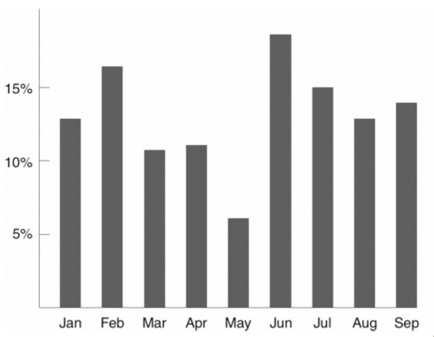 Remove Unnecessary axes
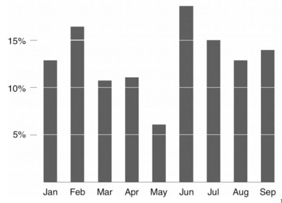 Using guide bars and removing axes line